NOW BOOKING 2025 + 2026
6 Wedding Color Palettes For Bright, Airy & Colorful Photos
When Mike and I got engaged, I had NO idea where to start with choosing a wedding color palette. I think I chose like 5 different wedding color schemes before we finally settled on royal purple, navy, blush, and silver. But there was one big problem with this color palette that I didn’t realize! 🙈
You see, we got married before either of us were photographers or knew anything about how different light and colors photograph. We wanted bright, vivid, airy images, but had no idea that the color palette we chose actually prevented us from getting the types of images we wanted! That’s right! The deep purple and dark navy meant a heavier, darker look to our images. And *spoiler alert* we don’t like our wedding photos much (not just because of the dark colors, but it’s one big reason!).
Now that we’re wedding photographers and know more about colors and light, we are AMAZED at how different color palettes can affect the look of the final gallery so much!
Most of our couples hire us because they adore our bright, airy, romantic, and colorful style! But they don’t always know that their color palette may impact how consistent their gallery appears next to our portfolio images.
Darker colors like wine red, deep navy, and emerald green are beautiful, but they can lead to “heavier” images (deeper shadows, more contrast, and less airy-ness and softness!). There is absolutely nothing wrong with choosing these as your wedding colors – in fact, some of our favorite wedding images we’ve ever taken featured these colors! It’s just important to know that your photos may not feel as bright and airy with darker colors.
Meanwhile, lighter colors like different shades of pastels, “dusty” rose/sage/blue/etc, and neautrals photograph much softer. This results in a more bright and airy feel, while still giving you pops of beautiful color! And personally, I feel like these colors tend to photograph more romantically, rather than bold.
So! Without further ado, here are 6 different wedding color palettes that we LOVE and will help you achieve a bright, airy, romantic, and colorful feel to your wedding gallery 😍
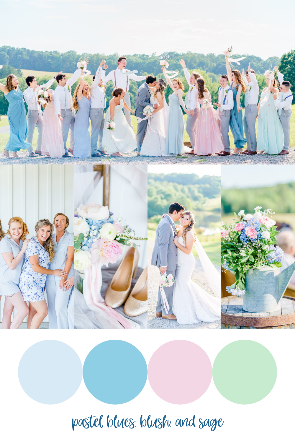
Pastel Blues, Blush, & Sage Green

This is one of our favorite wedding color palettes! It’s perfect for a spring or summer wedding – maybe even for a winter wedding for a bit of an “Elsa’s Ice Castle decorated with pretty pink flowers” feel! Rebecca & Daniel really pulled this color palette together by having each bridesmaid wear a different pastel color, the groomsmen wear light gray suits with different color suspenders, and beautiful pastel colored bouquets! So gorgeous, right?! See their full blog post here.
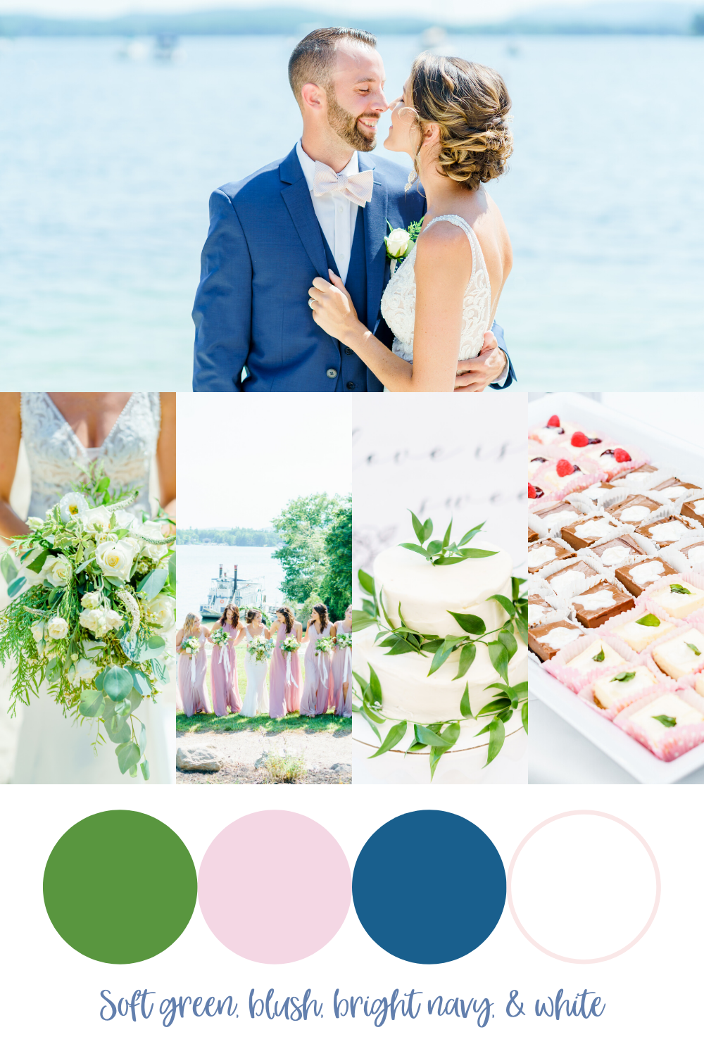
Soft Green, Ivory, Blush, & Bright Navy

Eva & Kurt opted for a simple color palette centered around white/ivory and greenery, featuring blush and bright navy accents. What we loved about their color scheme was that the greenery was more of a soft green in tone rather than deep, emerald-toned greenery. The blush pink and brighter navy accents also provided pops of color throughout the day! See their full blog post of wedding images here.
Pastel Blue, Soft Pink, Lavender & Pale Yellow

This was one of our favorite wedding color palettes of the season! It reminds me of Easter, but can be used all year round! I mean, how dreamy do these colors look together in Lauren & Nate’s wedding photos?! 🥰 I think the bridesmaids could wear ANY of these colors and it would make for such a gorgeous look! See Lauren & Nate’s full wedding blog post here.
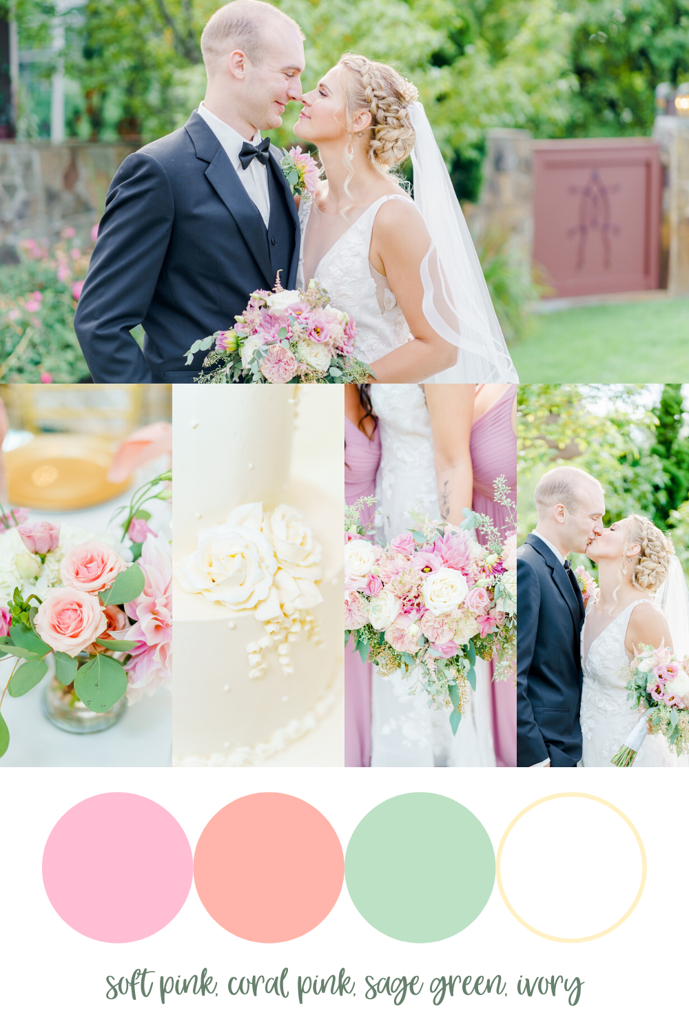
Soft Pink, Coral Pink, Sage Green, & Ivory
 Breann was so thoughtful and intentional when it came to her and Lucas’ garden wedding design. Her floral arrangements featuring coral pink and white roses, eucalyptus, and stunning pink dahlias were jaw-droppingly beautiful. The warm tones of this color palette really paves the way for romantic images! See the rest of their wedding photos here.
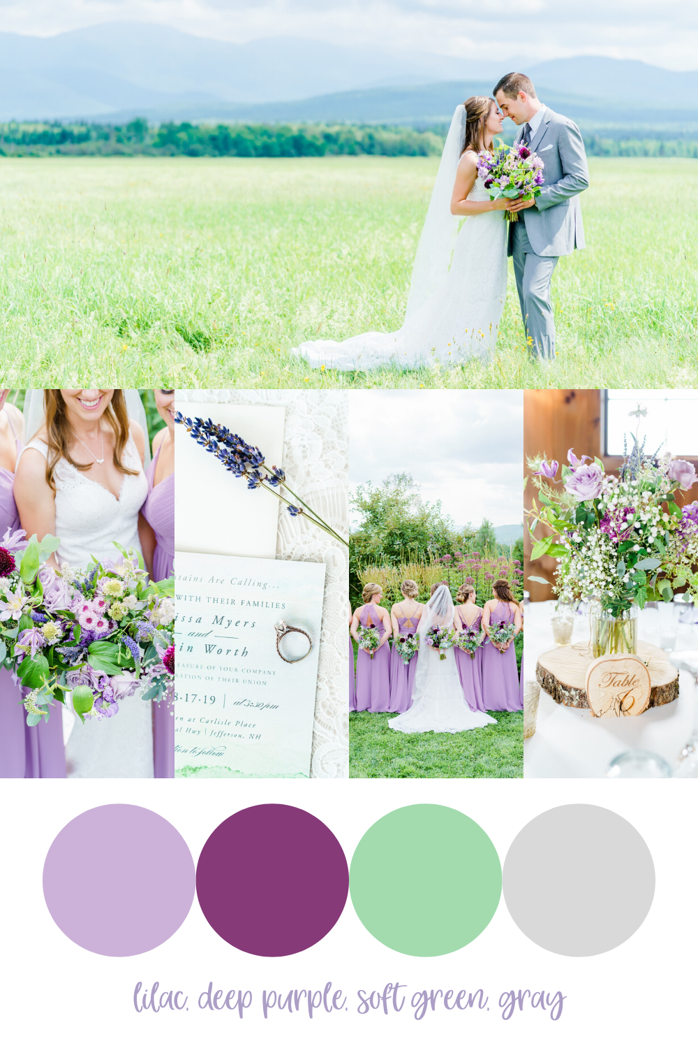
Lilac, Deep Purple, Soft Green, & Gray

If you know me at all, you know that I LOVE purple!!! So does Mike, but I’m a wee bit obsessed with it. So of course, I absolutely LOVED Melissa & Justin’s purple wedding color palette! 💜 In fact, our love for purple is one of the reasons Melissa & Justin chose us as their photographers! What I love is that the different purple shades aren’t too bright or overpowering! They are soft, romantic, and tied together with delicate greenery and baby’s breath. See their full wedding feature here.
Dusty Blue, Sky Blue, Blush, & Gray

Destinee & Kenny’s wedding color palette was a dream! It was light and airy with dusty blues, pale sky blue, blush, and gray/silver. This color palette photographs so soft and romantically, and we absolutely loved the alternating bridesmaid dress colors! And guys…how stinking cute are those shoes?! We just love when all the details are so thoughtfully curated to match the color scheme. See their full blog post feature here!
Looking for a bright & colorful wedding photographer for your New England wedding?!
GET IN TOUCH!
LEARN MORE ABOUT US!
FIND MORE ON THE BLOG!
Do you want bright, colorful and genuine photos like this for your new hampshire or new england area wedding?
learn more about us
get more info about weddings
reach out to us
Leave a Reply Cancel reply
You must be logged in to post a comment.